How Do I See Exactly Where My Money Is Going?
A total tells you how much you spent. It does not tell you which model changed, which project got busy, or which request produced the charge.
AI Gateway records those dimensions as requests pass through it. We will seed a demo project, read the aggregate charts, and open one request record.
Outcome
Trace a spend change from a dashboard chart to one synthetic request and its model, project attribution, latency, and cost.
Fast Track
- Run
pnpm seed-trafficfrom the demo app - Open AI Gateway Usage and select the current-day range
- Open Requests, filter to the demo project, and inspect one row
Hands-on exercise
Use an isolated demo team or project. The traffic generator gives order chat most of the volume and sends smaller workloads to other models. This creates useful charts without exposing production prompts or customer traffic.
Run:
pnpm seed-trafficThe script logs each request as it lands, then prints a per-feature summary:
order-chat        openai/gpt-5.4-mini                35 sent  42,180 in / 3,904 out
menu-translation  google/gemini-3.5-flash-lite       15 sent  17,865 in / 1,410 out
daily-special     anthropic/claude-sonnet-4.6         8 sent   9,528 in / 1,102 out
...
Seeded 100 of 100 requests across 7 models.
Dashboards update within a few minutes; Custom Reporting rows can lag a little longer.
Pass a number for a smaller run with the same proportions: pnpm seed-traffic 25. On the free tier, a model outside the free subset fails its share of requests; the summary counts them, and the charts still fill in from the rest.
Try It
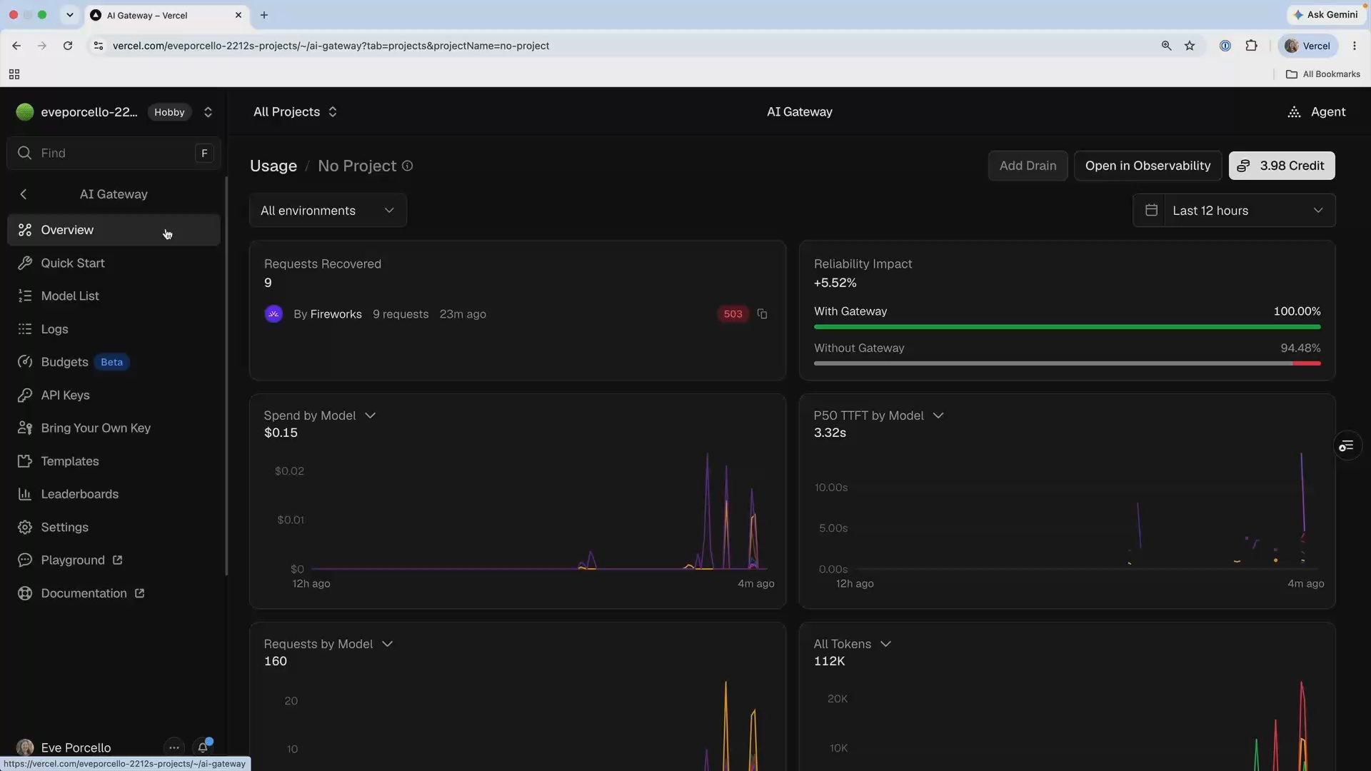
Wait for the requests to appear, then open AI Gateway in the dashboard.
In Usage, answer three questions:
- Which model handled the most requests?
- Which model has the highest time to first token?
- Which model contributed the most spend during the selected range?
Next, open Requests, filter to the demo project, and choose one synthetic row. Confirm its timestamp, model, project or API-key attribution, and cost. The row identifies the request behind the aggregate chart.
If the charts are empty, verify the terminal run succeeded and allow for dashboard ingestion. Do not switch to production traffic just to make the graph interesting.
Bookmark It
Bookmark the AI Gateway Usage and Requests views. They answer different questions, and production investigations usually move between both.
Done-When
- The Usage view contains synthetic traffic for at least two models
- You can explain one change in requests, latency, or spend from the chart
- You opened one request and found its model, attribution, and cost
- No production prompts, user IDs, or unrelated request records were exposed
Solution
The complete traffic generator lives at scripts/seed-traffic.ts. Its weighted mix sends most requests to inexpensive models and enough traffic to pricier models to make the Spend chart useful. The condensed version below shows the request plan; the full script adds jitter, small concurrent waves, a retry on 429, and the per-feature summary.
import { generateText } from "ai";
import { TRUCK_INSTRUCTIONS } from "../lib/menu";

const total = 100;

// Weights are per hundred requests. The full table has seven features;
// swap models freely, the dashboards chart whatever shows up.
const features = [
  { tag: "feature:order-chat", model: "openai/gpt-5.4-mini", weight: 35 },
  { tag: "feature:salsa-hotline", model: "deepseek/deepseek-v4-flash-0731", weight: 14 },
  { tag: "feature:daily-special", model: "anthropic/claude-sonnet-4.6", weight: 8 },
];

const plan = features.flatMap((feature) =>
  Array.from(
    { length: Math.round((feature.weight / 100) * total) },
    () => feature,
  ),
);
plan.sort(() => Math.random() - 0.5);

for (const feature of plan) {
  await generateText({
    model: feature.model,
    instructions: TRUCK_INSTRUCTIONS,
    prompt: "One synthetic taco question, in character.",
    providerOptions: {
      gateway: { user: "customer-107", tags: [feature.tag] },
    },
  });
}
Because the traffic is synthetic, every chart and request row is safe to inspect during the exercise.
Related Questions
Was this helpful?