Last month, we released improved accuracy for Vercel Analytics charts—making it easier to visualize trends over time. This initially began as a side project I worked on during Vercel's Design Your Friday program (on the first Friday of every month, we work on a project of our choice). The goal: improving the data visualization of our Analytics charts.
Let's dig deep on this new change.
Link to headingBefore and after
Previously, all the data points were visualized by simply connecting them as a line.
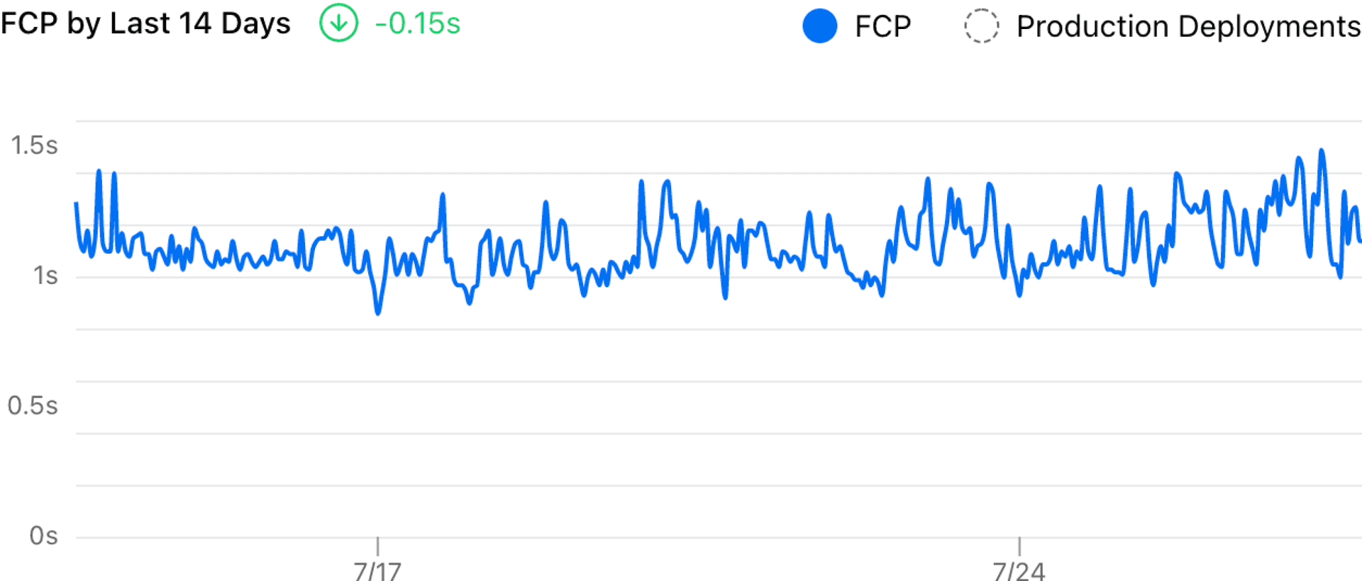
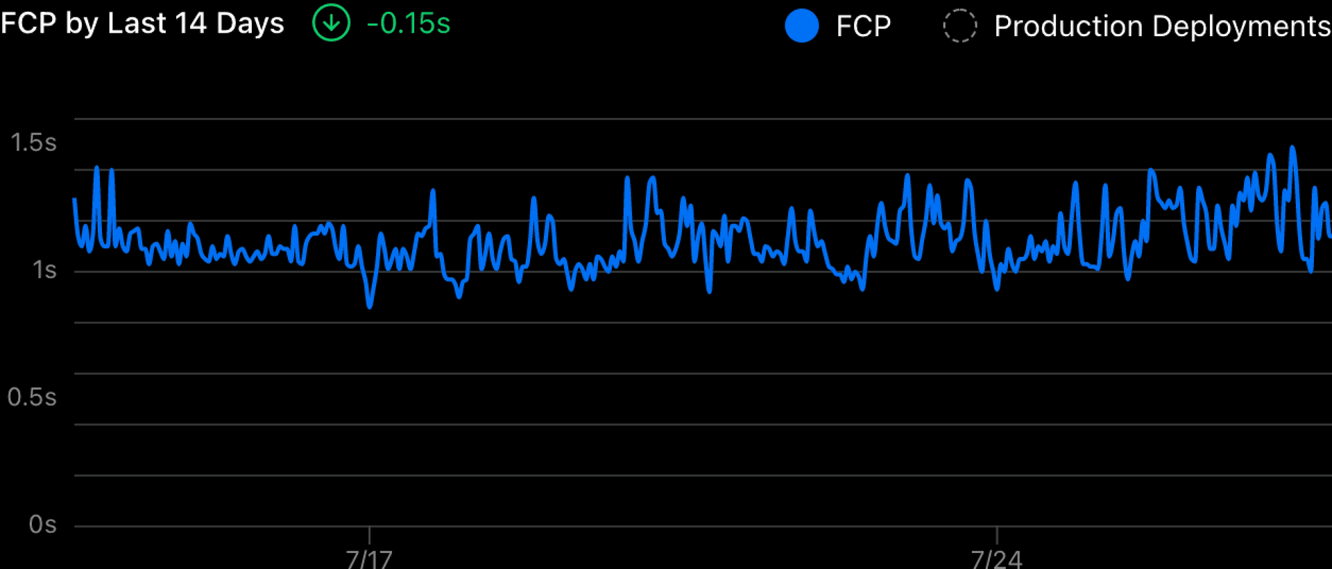
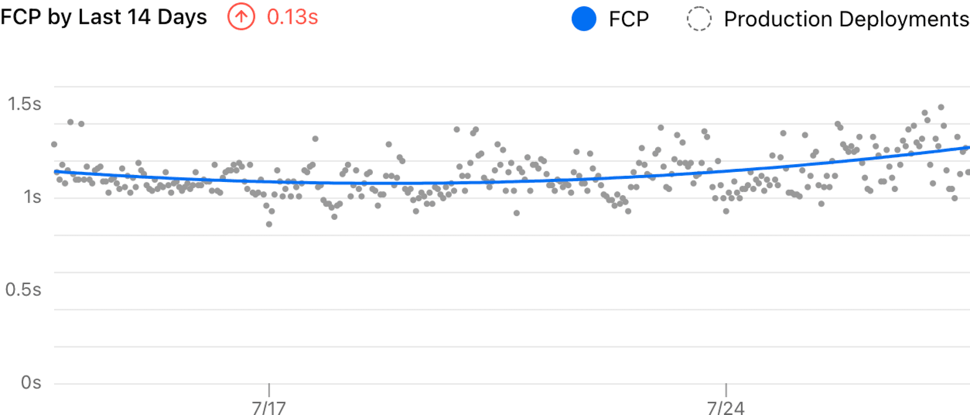
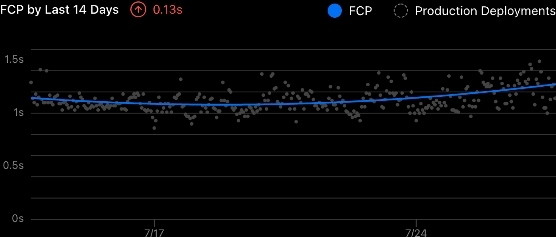
It’s hard to read the trend from that chart because it’s too noisy. And the delta showed a -0.15 decrease which felt wrong. With the improvement I made, it now uses a smooth curve to visualize the trend and measures the delta more accurately.
Link to headingThe challenge
There are two main challenges in the old visualization.
It displays all data points on the chart and this makes the chart noisy.
The delta shown was calculated by subtracting the last and first sampled data—which is unreasonable for this dataset.
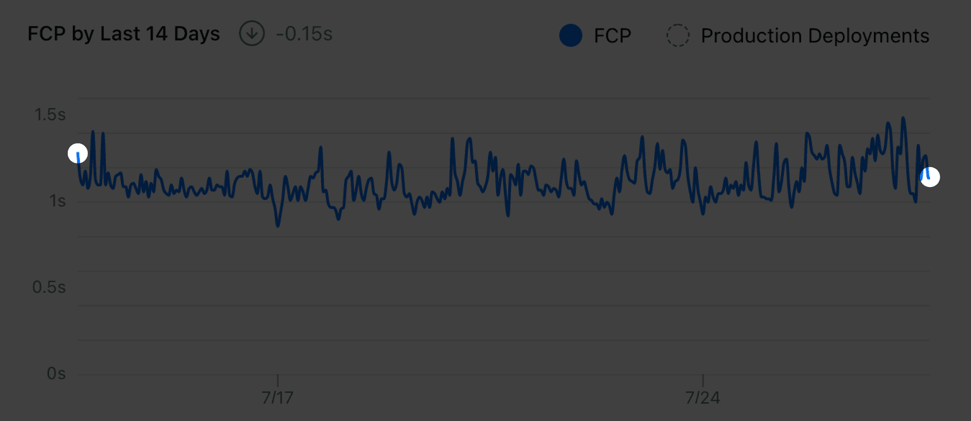
While the chart says -0.15, all the data in between was completely ignored. As long as the most recent data point shows improvement, the chart will conclude that my website is performing better. The difference between the first and final endpoints of the chart could be two users who happen to have very different network connections—but that doesn't tell the whole story about our site performance.
We want the insights that you receive from these charts to be accurate, easy to parse, and actionable. What can we do to make this chart tell a more authentic story?
Link to headingA better way
After some research, I found that curve fitting is a simple way to solve both problems. We use a curve to represent the overall trend of our data in a time series—with as little noise as possible.
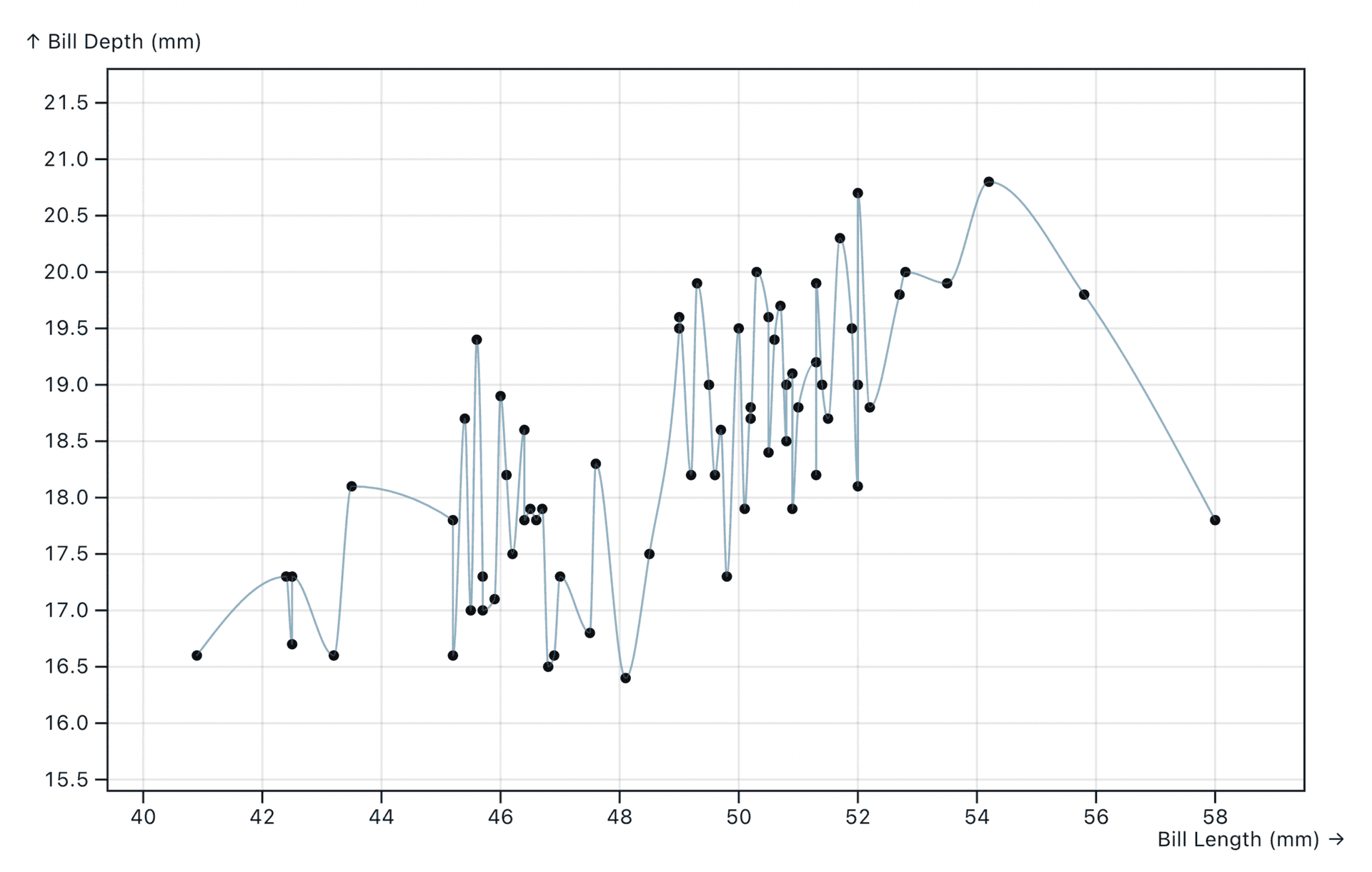
To demonstrate, I built an example that uses the palmerpenguins dataset to visualize the relationship between the bill length and depth of sampled penguins. It’s a bit noisy just like our previous Analytics chart.
If you already know the type of curve that you are looking for, there are many existing algorithms to calculate the fitting curve for a given set of data points. The easiest way is to do a linear regression—finding a straight line to describe the data.
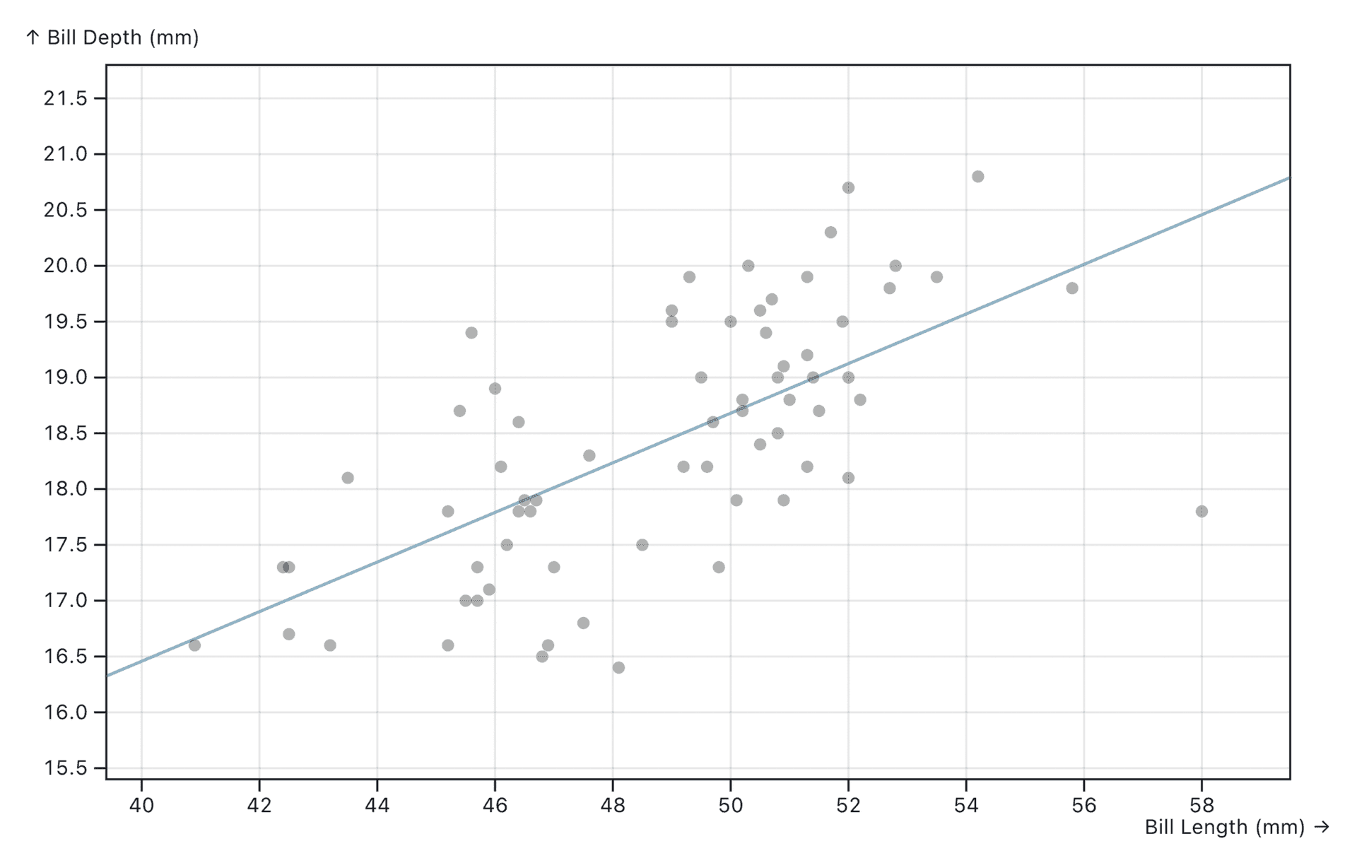
Linear regression is just a special case of polynomial regression where the order is 1. You can drag the slider above to see how different polynomial orders affect the fitting curve. When the order is N, the polynomial function will have a degree of N, and the curve will have N-1 turning points (so 1 is a straight line).
The Mean Squared Error (MSE) value (Σ(value - predictedValue)^2 / dataNum) measures the "goodness" of the fit of the curve to the data. The smaller the error is, the better the curve describes the given data.
Usually, the easy solution would be manually choosing a reasonable order and hardcoding it in our visualization. That’s what a lot of people do and, in most cases, it should be okay. However, when we don’t know the behavior of the data (is it constantly increasing or decreasing? is it periodic?), it’s hard to choose a good order.
As you might notice, a higher order will result in a more “accurate” curve with a lower error in general—but it also results in a more noisy curve. It can turn the curve too many times to follow our data because of all the noise. This is called overfitting.
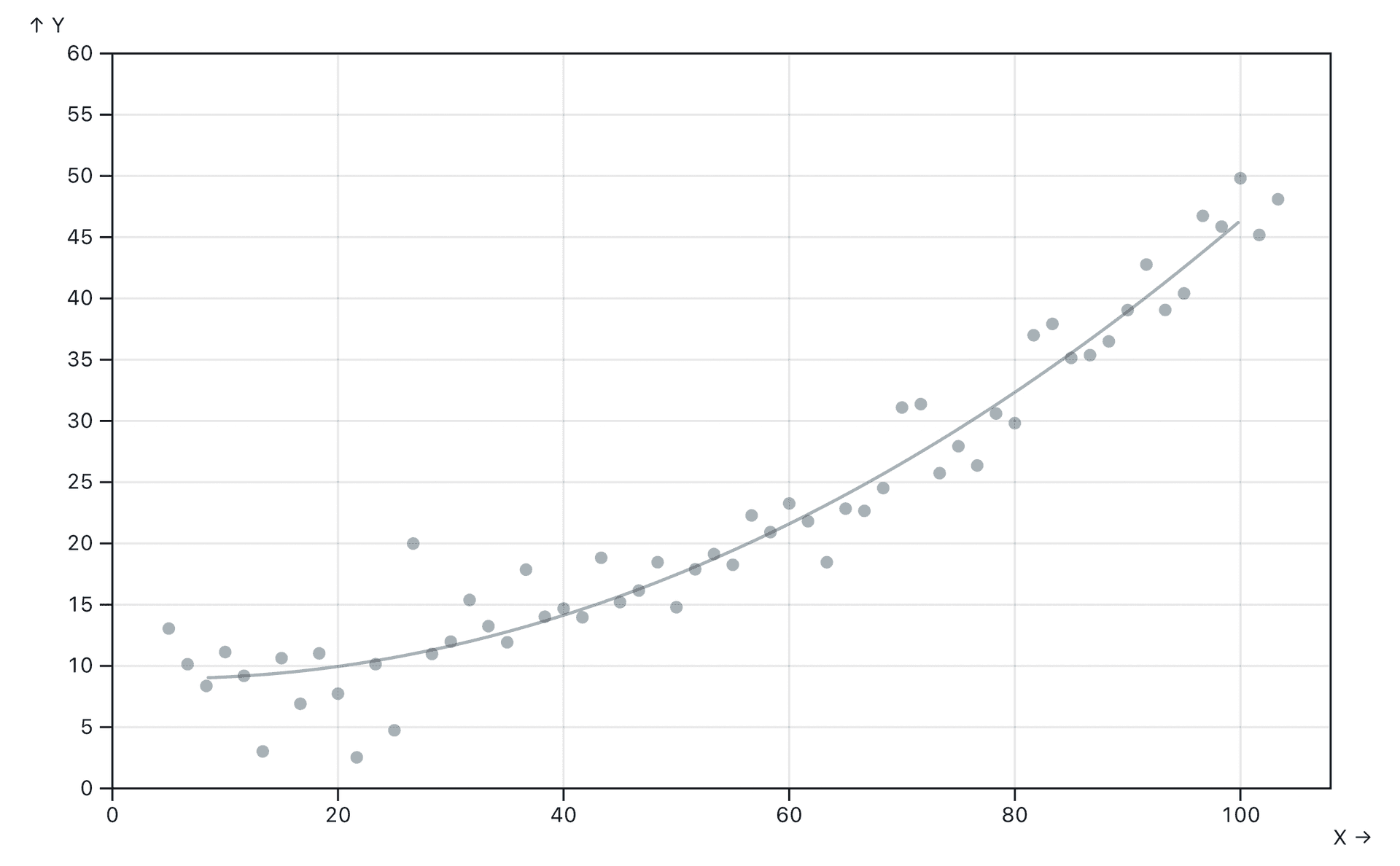
You can play with the example below on Observable: it generates fake data points with some normal distributed randomness and then calculates the regression curve for it. For the “Constant” dataset, it’s better to just use a straight line to fit (order = 1). However, for the “Quadratic” dataset, selecting order = 2 will result in a more stable, better fitting curve.
Link to headingThe "good" fit
All the examples so far show a “bad fit” or an “overfit” curve. It might describe the current dataset well, but, when you regenerate the data, it will not describe the new data accurately.
This is a very foundational concept in Machine Learning and Data Science—to split the data into a training set and a test set. The training set (the current data) is used to train the model and calculate the regression curve, and the test set (newly generated data) is used to evaluate how well the model works. A good fit for the training set should have a low error on the test set, too.
In our real-world problem, we don’t actually have a training set and a test set (we don’t generate random data) and all we have are the numbers collected from production. But we can choose some data points as the training set, and the remaining ones become the test set. To make the algorithm deterministic, I split our data points by odd and even indexes.
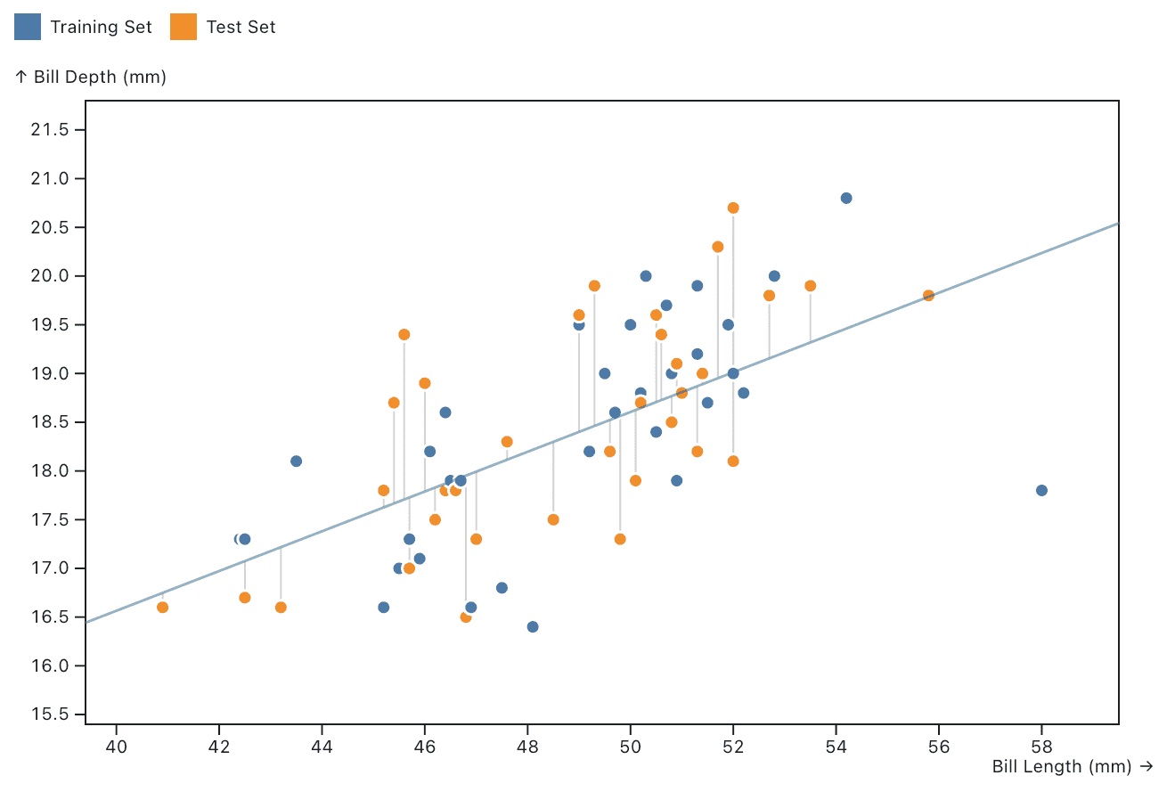
As shown in the example above, we use the training set to calculate the fitting curve and measure the error for both the training set and test set. If you increase the order, the curve tries to follow the points, but the gray lines show the error for points.
Ideally, a good fit should have a low error for both datasets. We will use a simple but intuitive equation error = max(MSE(training set), MSE(test set)) to measure the “overall goodness” of the fit for the entire dataset. Usually, when we increase the order of the polynomial regression, the error will decrease (underfitting), hit a good fit, then increase again (overfitting).
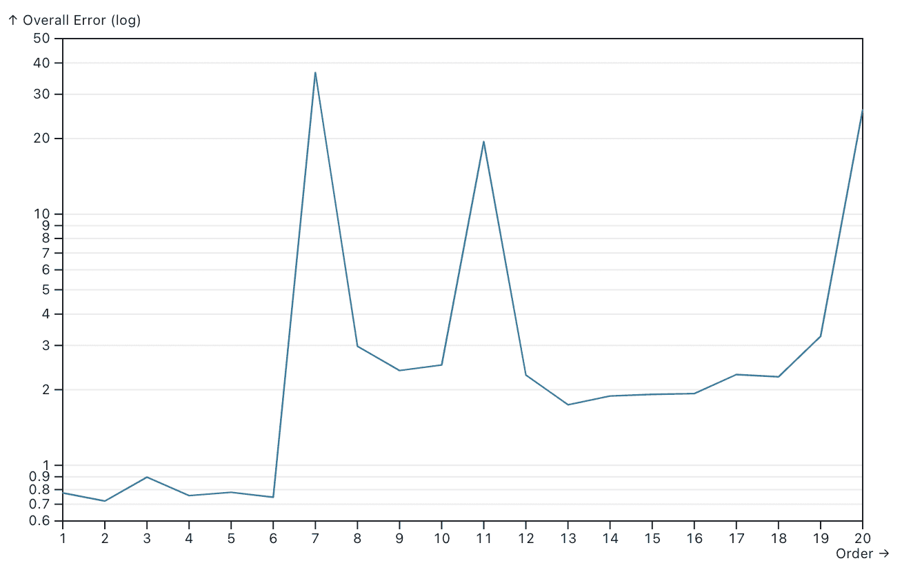
This chart shows the overall error max(MSE(training set), MSE(test set)) when the polynomial regression order increases. It’s clear that when the order is 2, we have the best fit for the data—which is what we can feel intuitively from the interactive example.
Finally, we can use that regression curve for the actual visualization and estimation. This adaptive approach is simple, easy to implement, and turned out to work really well for our case.
Link to headingTry it out
To try out this new change, enable Vercel Analytics today by visiting the Analytics tab in your project dashboard or try it free with a team on Vercel Pro.